Chen Z Noodle House
Brand Identity and Marketing Collateral
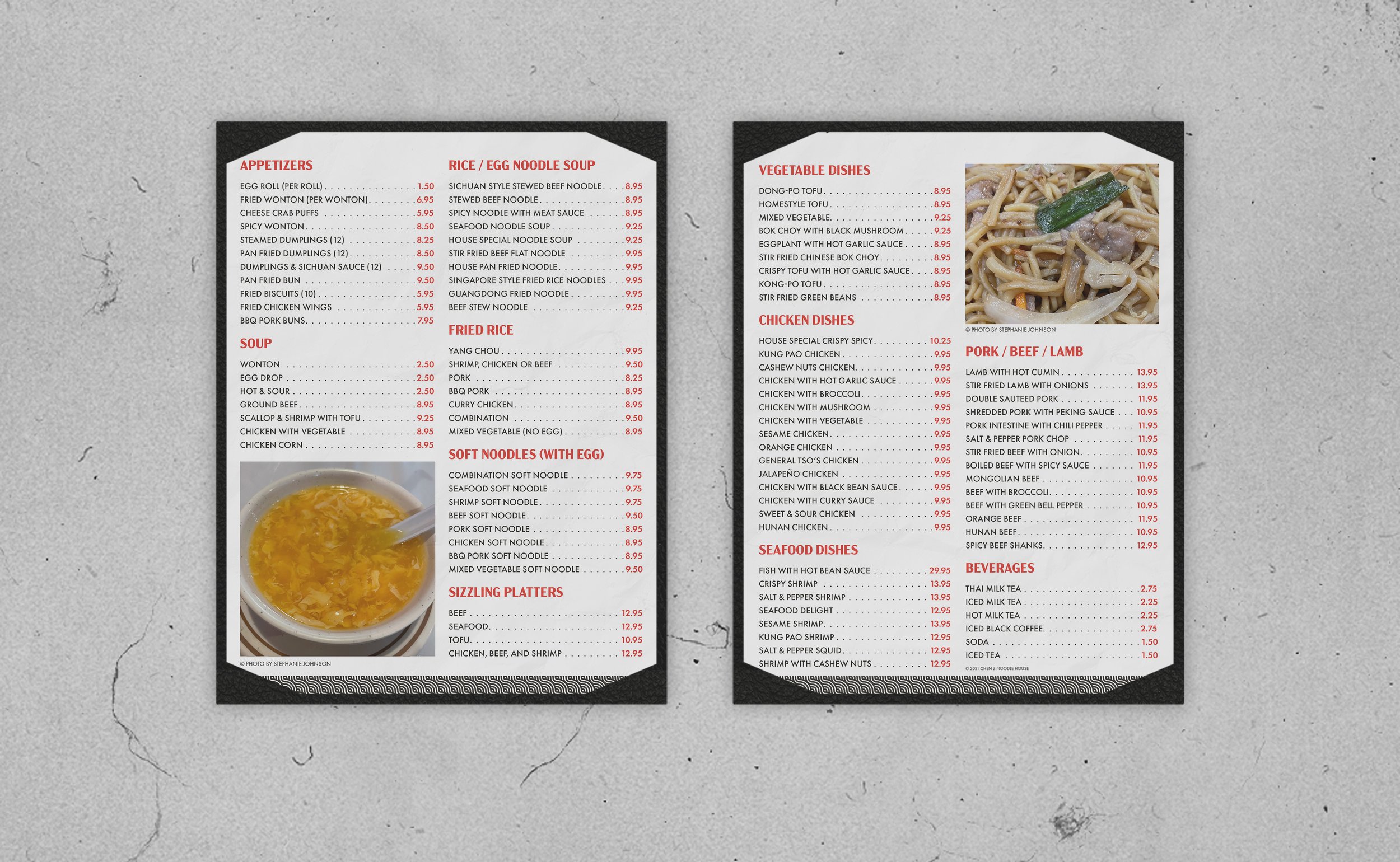
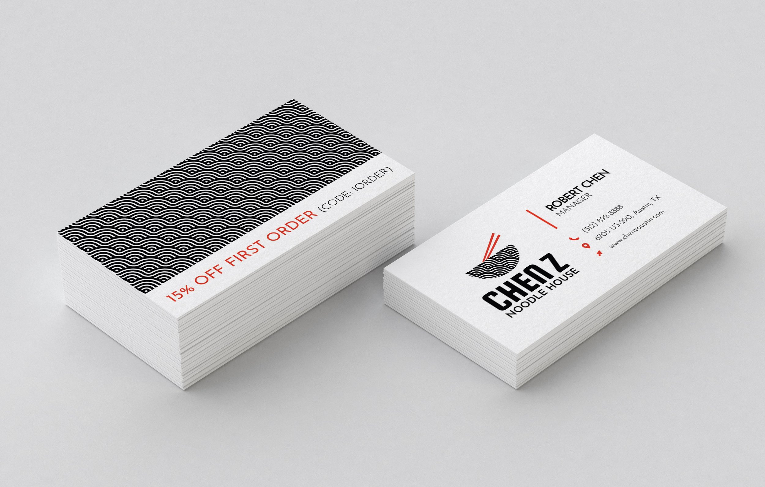
Chen Z Noodle House Restaurant opened in 2014 and offers authentic and delicious Chinese cuisine in Austin, TX. Chen Z does not have a branding system. Their restaurant is filled with posters created by hand in Mandarin or hastily scribbled out in English. I was challenged to create a unified branding system and create an attractive, effective menu design.
The Moodboard
Chen Z serves incredible food at reasonable prices, so I decided to give the branding an upscale, casual vibe. I chose images full of color, delicious food, and a relaxed environment to help spur my creativity as I prepared to create the digital drafts.
Digital Drafts
I experimented with serif, sans serif, and script fonts in my initial round of digital drafts. The sans serif type best matched the restaurant's upscale casual vibe, and the bowl's pattern resembles noodles.
The Solution
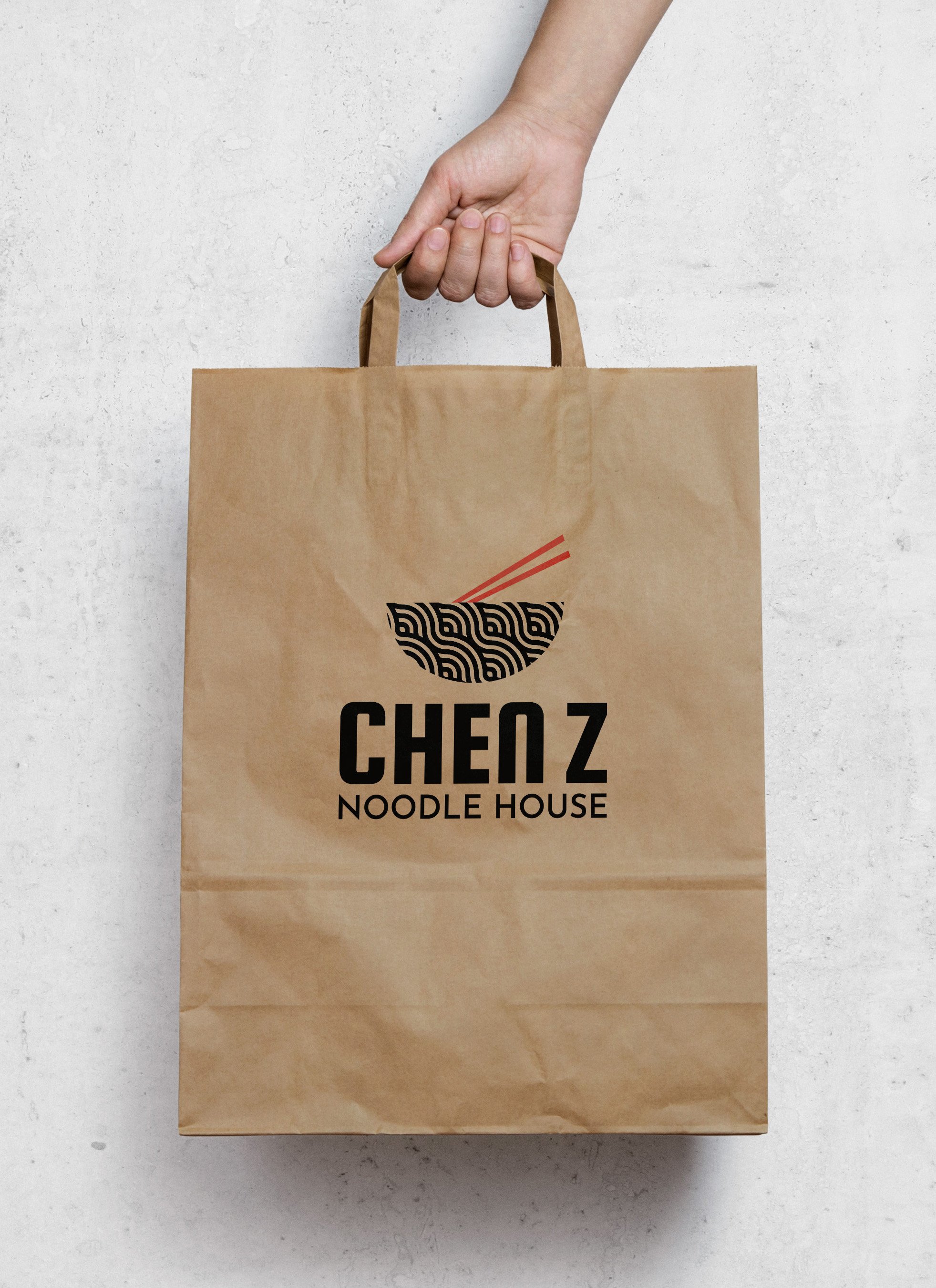
I combined two logos in my digital drafts to create the final solution. The final design is a sophisticated and memorable logo that stands out from the competition.

Reflection
Dozens of kitschy, run-of-the-mill Chinese and Asian fusion restaurants are within 10 square miles of Chen Z. To stand out, Chen Z needed a distinctive identity, and their new brand delivers. I love the red, gold, and black color palette and had fun creating the noodle pattern. This could turn into a more cohesive campaign with the addition of a website.


