San Marcos is a college town about 30 miles south of Austin, TX. It’s close enough to access a larger metropolitan area but far enough away to maintain its identity. It’s a town bubbling with possibilities for personal growth, a relaxed lifestyle, and entrepreneurship.
San Marcos, Texas
City Branding Identity
The Moodboard
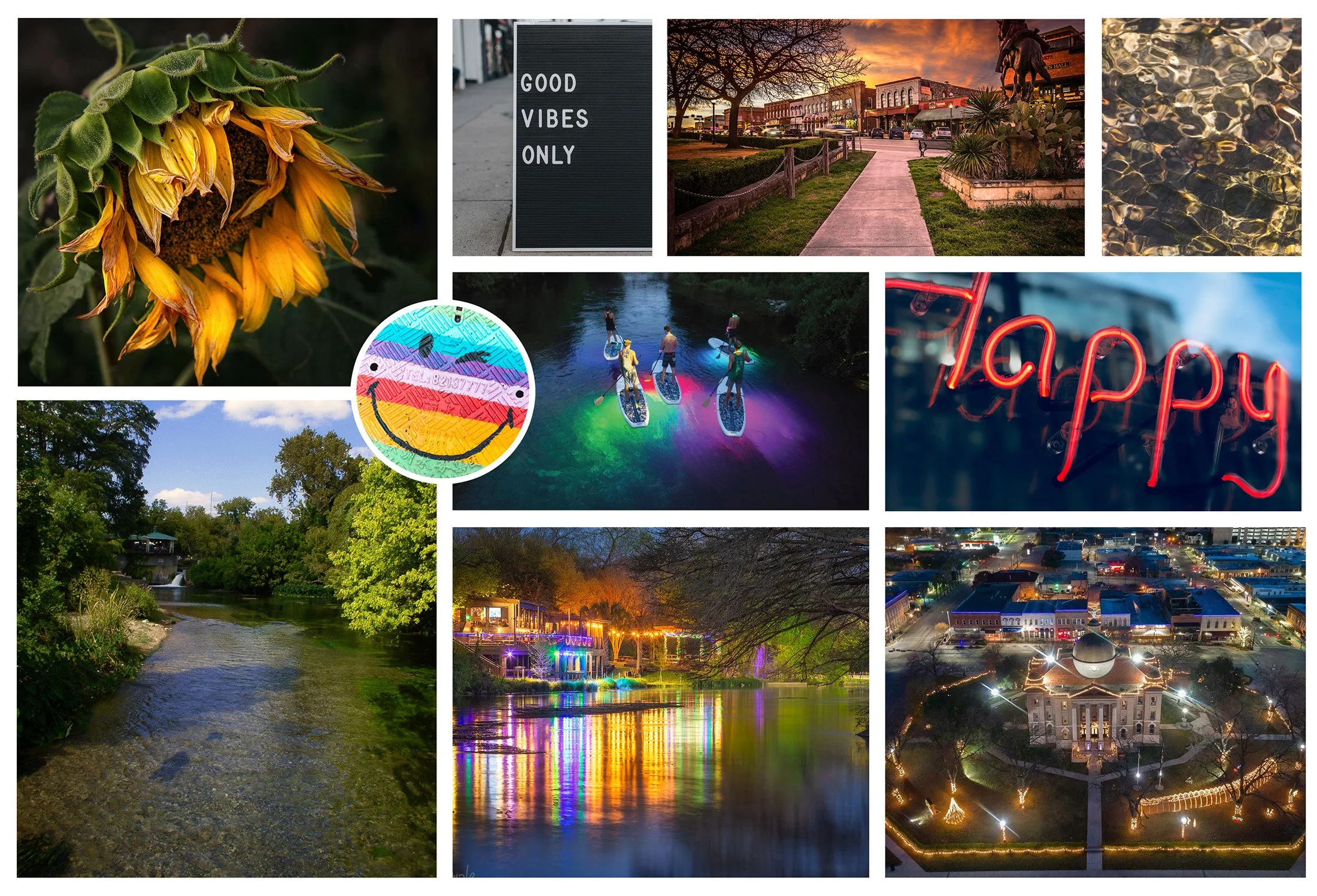
The moodboard captures the city's fresh, laid-back, and casual essence. The natural setting and old town charm exude happiness, while the San Marcos River offers citizens and visitors a place to relax.
The Sketches

The San Marcos River winds through the town and is integral to the city’s identity. The “S” in San Marcos resembles the river, so I brought that into my sketches. I also wanted the logo to be a handwritten mark representing San Marcos’s casual and friendly nature.
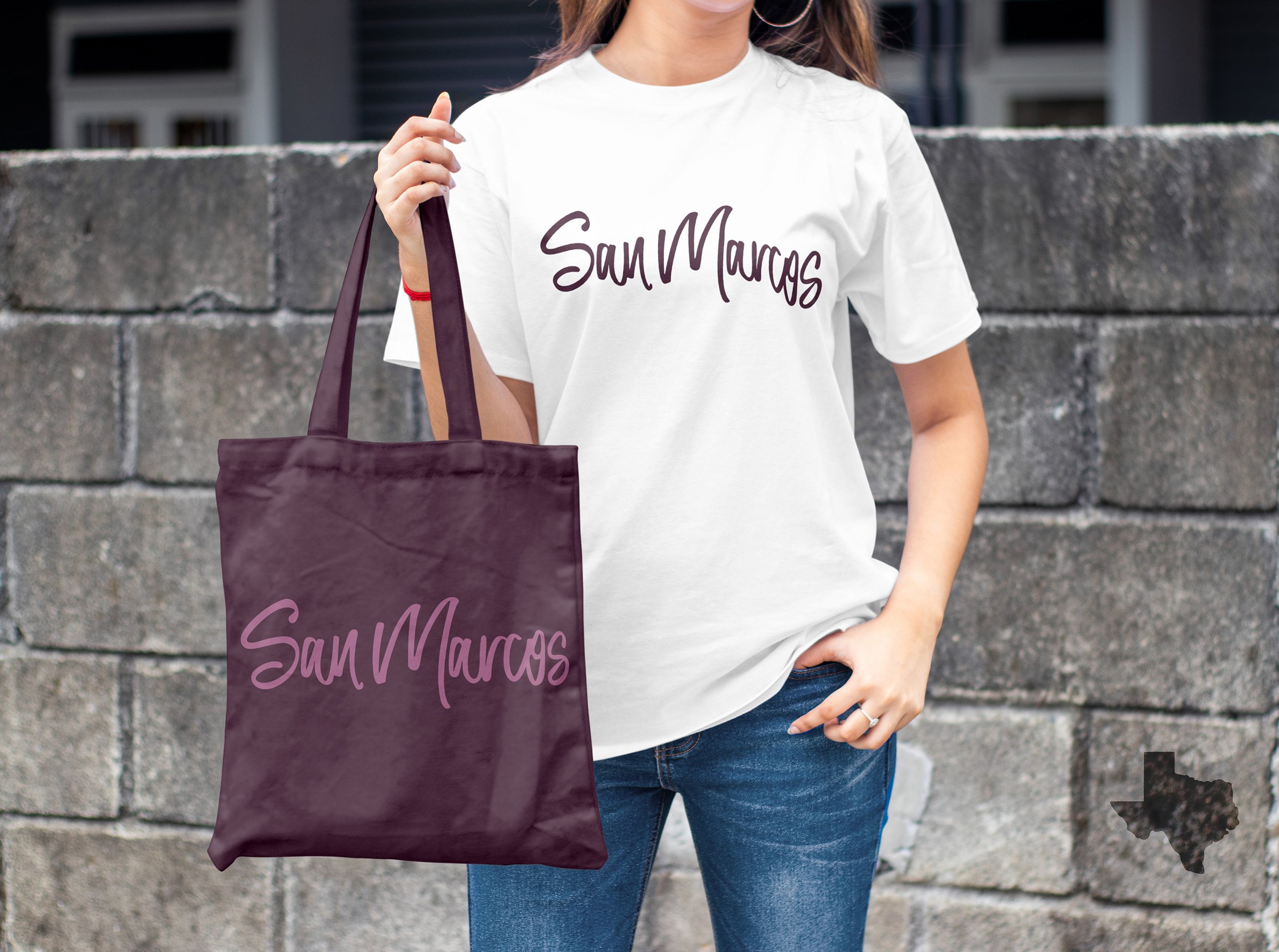
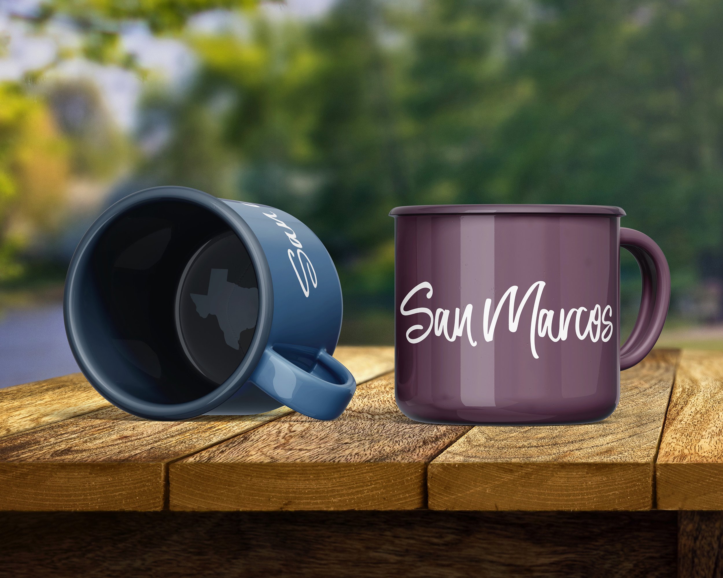
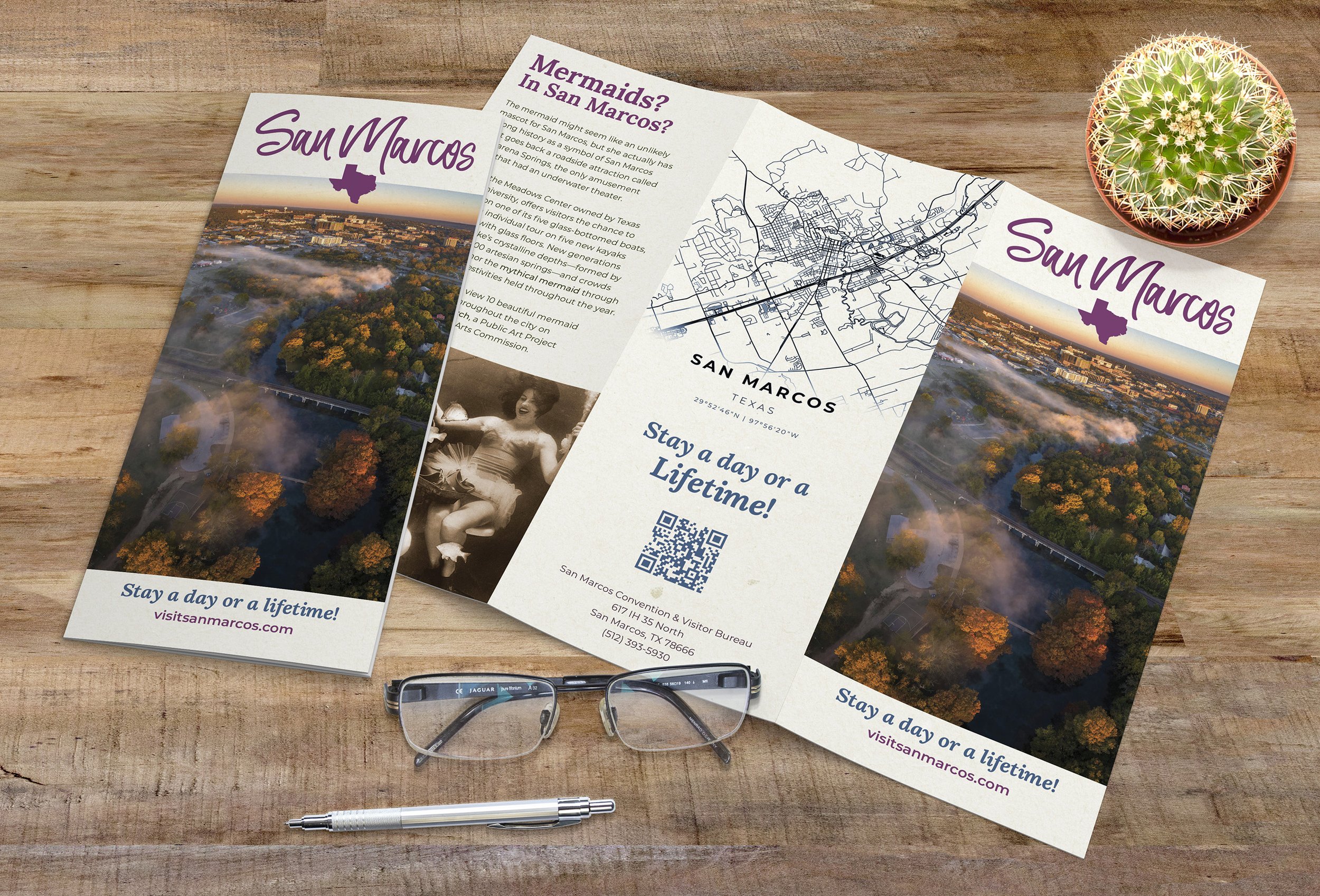
The Solution

I wrote out the logo by hand and then scanned it in. I played with the thickness of the lines and flow of the letters so that the S and the M look like the meandering San Marcos River. I included the shape of Texas in particular graphic design situations to add distinction.
Reflection
I feel that the new brand identity for San Marcos, TX captures the city’s relaxed, casual atmosphere. The hand-drawn logo is a far cry from the buttoned-up, suit-and-tie atmosphere of larger Texas cities, and it reflects the casual nature of the citizens.